In 2025, ad click costs are rising, so landing page development becomes a logical way to “squeeze” more out of the same traffic. Below is a simple, practical guide with a focus specifically on WordPress + WooCommerce and PrestaShop projects. The first part covers the “why and how”, the second – concrete implementation tips.
When and why it’s worth creating a separate landing page
- When you have one clear offer: a new product, a limited promotion, a service package.
- When the campaign audience is narrow: Google Ads by keyword, Meta Ads by interests.
- When you need one goal: an inquiry, registration, or purchase without distractions to the menu or blog.
In short: a landing page is a tunnel, not a maze. One message, one goal, one path.
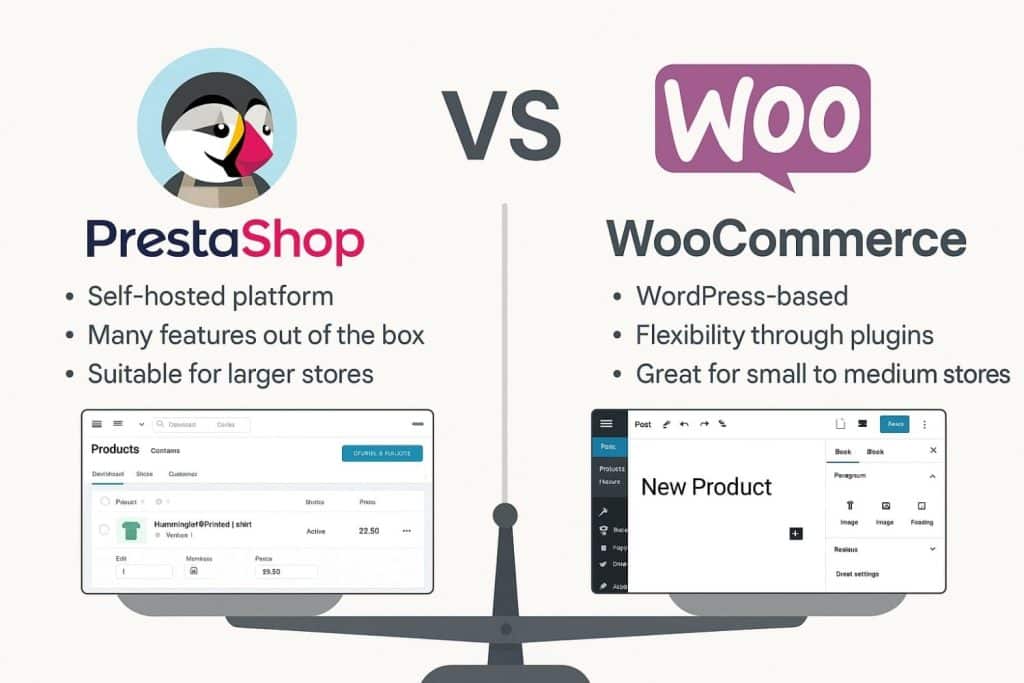
The real difference between WooCommerce and PrestaShop
WooCommerce (WordPress)
- A landing page can be built very quickly using blocks (Gutenberg).
- Convenient for creating a “Buy Now” flow: button → cart → one-step checkout.
- Many integrations with email marketing, forms, and lead magnets.
PrestaShop
- A solid structure, especially when you have a large catalog and B2B rules.
- Convenient for creating a category or collection-type landing page (filtering, showing variants, price rules).
- Think through delivery and payment combinations in advance – they strongly affect conversion.
In both cases, the same logic applies: one page = one goal. The difference is how fast you can build it and how much flexibility you need.
A simple structure that works
1) Hero: short value proposition + one action
- An H1 with a clear benefit and the landing page development keyword.
- 1–2 sentences explaining what you get.
- One button (“Buy now”, “Get an offer”) – if it’s a purchase, show delivery time and return policy.
2) Offer details
- What exactly the customer buys/gets: specifics, timeframe, what’s included.
- If WooCommerce: a short product bundle or one VIP product.
- If PrestaShop: attributes/variants visible immediately; clear price, discount, stock.
3) Social proof
- 1–3 short testimonials with names/positions.
- Client logos, numbers (“+120 projects”, “4.9/5 rating”).
4) How it works
- 3–4 steps: choose → submit details → pay → receive.
- If it’s a service – add timelines (“we prepare it within 7 days”).
5) FAQ
- 5–7 real customer questions: delivery, returns, warranty, payments, invoices.
The idea of the structure – fast decision-makers need only the hero + button, skeptics are convinced by proof and FAQ.
UX details that increase conversion
- One goal. Menu – minimal or hidden.
- Short form. Only essential fields; auto-fill city by postal code.
- Button text. “Get a quote within 24h”, “Buy now – delivery in 1–2 business days”.
- Visuals. One main hero image, others lazy-loaded.
- Mobile. Large headings, 16–18 px text, sticky bottom CTA.
Speed and technical setup (simple version)
In general:
- Use WebP/AVIF for images, set
widthandheightto prevent layout shifts. loading="lazy"everywhere except the hero visual.- Minimal JS, no unnecessary scripts.
WordPress + WooCommerce:
- Block-based (Gutenberg) sections without heavy builders.
- Cache + CDN, generate images in multiple sizes.
- One-step checkout (if possible), “Buy Now” buttons.
PrestaShop:
- Rules: variants and prices must be clear in the landing page without extra clicks.
- Loading optimization: reduce module block “noise” on this page.
- One-page checkout, guest checkout, clear delivery timelines.
Content without the fog
- Write specifically: what’s included, until when the offer is valid, how fast they will receive it.
- Avoid “highest quality”, “years of experience” – it says nothing.
- One landing page = one audience. If there are several – create variants.
Tracking: what must be connected
- Events: view, CTA click, form submission or purchase.
- WooCommerce: track
add_to_cart,begin_checkout,purchase. - PrestaShop: the same – it’s important that product IDs and prices match across all steps.
- In GA4 reports create a funnel: list → product → cart → checkout → purchase.
A useful resource on e-commerce UX (in a simple style, without mountains of theory): Baymard Institute.
A/B test directions (without complex theory)
- Headline. Promise vs. specific result (“-20% when buying today” vs. “Fast delivery in 1–2 days”).
- Hero image. Product in hand vs. product close-up.
- Form length. 3 fields vs. 6 fields.
- Price display. With shipping immediately vs. shipping shown at checkout.
One change – one test. One to two weeks with real traffic, then a decision.
Most common mistakes
- The page tries to be both a catalog, and a blog, and a contact page at the same time.
- Too many links – the user gets distracted.
- Too many checkout fields, unclear delivery timelines.
- Images without dimensions – jumping layout and worse LCP/CLS.
- Unverified GA4 events – reports show “nice” numbers, but not the truth.
Quick launch plan (WooCommerce and PrestaShop)
- Prototype with blocks (Hero → Offer → Proof → FAQ).
- Single-goal path: the button leads to the cart or form – nowhere else.
- Speed: one hero image immediately, others lazy-loaded, minimal JS.
- Tracking: track CTA click, form submission/purchase.
- One A/B test (headline or hero image).
- Adjust after 1–2 weeks based on data.
Internal content network
If you have more related articles or services, it makes sense to connect them with internal links (without overloading the landing page). For example, service descriptions, portfolio, a speed optimization guide.
Conclusions
A successful landing page is not a “nice picture” – it’s a clear offer, a smart structure, and a solid technical foundation. WooCommerce allows you to launch and test quickly, while PrestaShop helps you manage more complex commerce in a structured way. The most important things – one goal, specific content, stable speed, and measurable steps.